

One year ago today, Cracker Barrel unintentionally made marketing history.
On August 19, 2025, “a date which will live in infamy,” the chain retired its Old Timer — a man wearing overalls, arm casually draped on a barrel — after 48 years of tireless service.
The familiar figure was replaced with the minimalistic words Cracker Barrel in a clean, dark font atop a gold emblem, intended to enhance highway billboard visibility and act as a subtle nod to the brand’s plan to modernize storefronts.
What came in the days to follow? Pandemonium. Social media uproar. Public outrage. Even tweets from the executive branch.
Within seven days, the old logo returned. Within a month, the company had suspended its planned remodel of 600+ locations. By December, quarterly revenue across restaurant and retail sales dropped. A year later, the overseeing CEO stepped down.
Although the actual change of design was debatable (simplified wordmark, better legibility on a phone screen), it taught marketers everywhere a tough lesson.
What’s the difference between a brand refresh and a rebrand?
On paper, this could have been classified as a brand refresh — the kind of housekeeping most businesses do every few years without headlines, huffs, or the President running interference.
The problem? It landed like a rebrand.
For its customers, the Cracker Barrel logo was both timeless and nostalgic. It represented tradition, history, and a countryside familiarity that loyal patrons recognized and respected.
The new logo signified change, with unintended consequences that most couldn’t have predicted.
That gap — between the change you made and the change people think you made — can prove to be painfully expensive.
The difference in one sentence
A refresh keeps your story current. A rebrand rewrites your story.
A refresh sharpens the logo, tunes the palette, tightens the words, and updates the assets so your brand looks like it belongs in the year it’s operating in. The mission holds. The audience holds. The promise holds.
It’s the same everything, just slightly elevated and refined.
Nobody has to relearn who you are or what you offer.
A rebrand alters everything. Your brand identity, positioning, values, voice, sometimes even the name on the door.
It’s a public announcement that something structural has changed.
Cracker Barrel proved the market decides what any announcement means, and it decides fast. Your job is to make your intentions impossible to misinterpret.
A refresh is a response, not a change of heart
A refresh usually isn’t triggered by anything happening inside your business. It’s triggered by everything happening outside it.
Wildly, Cracker Barrel wasn’t the only brand taking a “crack” at a refresh in 2025.
In May, Amazon rolled out its first major identity update in more than two decades: a deeper, “more empathetic” curve on the smile, a custom saturated orange, and a new typeface. Days earlier, Google had replaced the flat color segments in its “G” with a smooth gradient alternative, marking a company-wide update.
Neither company changed course. They changed because their marks now must accommodate 40-pixel app icons, animated loading states, avatars in an AI chat window, and glyphs on a watch face — none of which existed when their prior logo renditions were crafted. The ground moved. The brands adjusted slightly, but remained still throughout.
Walmart’s January 2025 refresh (its first in 17 years) is another prime example. A new spark with more room to breathe and a new custom typeface. Walmart’s own creative lead described the work as aligning the visual expression with how the brand had evolved since 2008.
“There is a great, unique origin story about that typeface, its roots in our past and how we’re bringing it forward to represent the brand where it is today,” said David Hartman, Walmart’s VP of creative.
Not a new Walmart. The same Walmart, enhanced nearly twenty years later, still standing on the same foundation.
Amazon, Google, and Walmart vs. Cracker Barrel? The difference is subtlety. A strong refresh sends a subtle message: we’re still here, and we’re paying attention.
Customers may not even consciously register every facet of a brand refresh. But they also don’t get the nagging feeling that you stopped trying back in 2014.
A rebrand is the start of a new fire, when the business has changed
Rebrands earn their keep when there is a real structural basis underneath them — one where the old identity would actively misrepresent the company going forward.
A merger or acquisition. Think two airlines becoming one carrier. You need a mark that can credibly hold both.
Outgrowing your own name. Think a food-delivery app that now runs a grocery network, a wholesale supply arm, and a ticketing platform. The name on the door has become the smallest thing you do.
A genuine strategic pivot. Think a legacy automaker going electric-only and doubling its price point. The badge on the old hood is promising a car you no longer build to a buyer you no longer sell to.
A market you’ve soured. Think a regional firm that spent two years in the news for all the wrong reasons. Sometimes the equity in a name is negative, and the cheapest asset you can own is a clean slate.
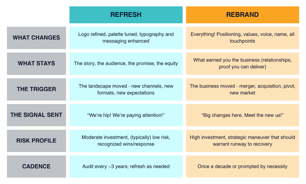
Side by side
The real lesson of the last twelve months
Cracker Barrel didn’t fail because the new logo was ugly. Plenty of people thought it was fine!
It failed because the company sent a rebrand-sized signal for a refresh-sized change, and used the language of transformation (rather than continuity) to justify it.
When you remove the single most recognizable element of a 48-year-old mark, launch it alongside a plan to remodel hundreds of stores, and frame it all as a “new era,” customers don’t hear “we improved our legibility on mobile.”
They hear “we have decided to become something else entirely.”
For a brand whose entire value proposition relies on remembering how things used to be, that reading was fatal — and the reversal came too late to delete it forever.
Remember: a refresh signifies evolution. A rebrand signifies a new identity.
Four questions that settle it
Before you spend a dollar, answer these honestly.
- Did your strategy change, or did your taste change? Being bored with your logo is not a business case. If your strategy is still intact, you can easily enhance your identity. If your strategy has genuinely shifted, a rebrand is how the outside catches up.
- Is there a structural event to point to? A merger, an acquisition, a new market, a product line that redefines the company, a name that no longer describes what you sell? If the answer’s no, you’re looking at a refresh. If the answer’s yes, you have your business case… rebrand with full confidence.
- What equity would you be spending? List the specific assets customers recognize you by (a shape, a color, a character, a slogan). A refresh protects this list. A rebrand puts it all in play. Know exactly what’s on the table before you clear it.
- What will the market conclude? Not what you’ll argue in the press release. What a regular customer will assume happened when they see the new mark cold, with no context. If that assumption isn’t true, change the plan or change the rollout. If you want them to conclude something has seriously changed, a rebrand is the only signal loud enough to do it.
In our experience, clients arrive certain of the answer about half the time — and are spot on even less often. It’s fair enough: the two situations look nearly identical from inside the business, where you already know why the change makes sense and assume the market will read it the same way.
Both assignments can offer serious returns to the right company at the right moment. The value isn’t in picking the bigger ticket or the safer bet.
It’s in knowing which one you’re actually looking at, and all the reasons why.
Where to start
Start with a brand audit.
Compare your current brand identity to your current strategy and identify the gaps: where the visuals lag the business, where the message is vaguer than the offer, where the assets break in the channels you sell through today (not the ones you built for six years ago).
You’ll walk away with something more useful than any opinion. You’ll have a case for one project or the other, scoped and priced, with full reasoning attached. It’s the document you’ll take to your partners, your board, or your own gut check at midnight.
It’s also the thing that keeps a refresh from quietly sprawling into a rebrand nobody anticipated, or a rebrand from getting talked down into a refresh that just won’t hold.
CAGnite runs that audit and both kinds of work that follow from it. Which means we have no reason to talk you out of either.
We’ll tell you plainly which one your brand is asking for and why, and which one is destined to accelerate your growth.
Stop guessing. Book a brand audit today.